Gatsby Department Store
GATSBY DEPARTMENT STORE
When fashion consortium Gatsby decided to open its newest store on the highly competitive, duty-free shopping destination of Isla Margarita, Venezuela, they came on a mission. They needed to reinvigorate the Gatsby brand in order to attract a younger, fashion savvy female target – millennials with 21st-century tastes, sensitivities, attitudes, and values.
The look-and-feel of the new retail space had to be innovative, functional, and visually impactful without being intimidating. Moreover, the design needed to be ‘eco-friendly’ – in keeping with the societal values of this younger target.
Furthermore, if successful, the new s tore design would serve as the prototype for an international rollout, and consequently, carried significant weight in the overall brand repositioning.
CHALLENGE
From day one, the space presented significant challenges: a sprawling 16,500 square-foot area with ceilings reaching 30 feet in height. To achieve the necessary brightness for proper retail display would be the first obstacle that needed to be overcome.
A mutual agreement with the client to employ only LED lighting within the store design only exacerbated this luminosity challenge.
This eco-conscious philosophy was extended even to the ‘invisible’ areas of the store. Energy-efficient HVAC systems were installed and recycled building materials were employed whenever possible.
RESULTS
Sales soared and store attendance surpassed all previous records. Based on the success of the design, Gatsby has extended its international rollout with future store openings slated throughout the United States, Latin America, and the Caribbean.
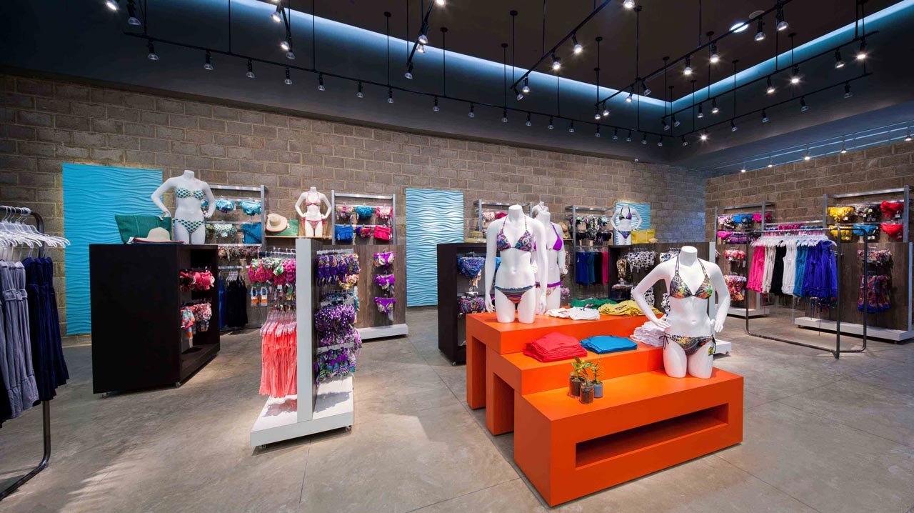
After thoughtful consideration, our designers transformed what began as an apparent obstacle into a starting point for the entire design. Employing an overhead network of translucent tensoflex beams – lit from within- they then dropped down an intricate system of directional lighting that not only solved any
illumination issues but moreover created a visually arresting motif of asymmetrical criss-crossing lines that would be echoed throughout the store. Existing cinder block – a potential eyesore – was retained not camouflaged: becoming the inspiration for an urban, industrial feel that would serve as the perfect backdrop for the colorful clothes.
By flipping potential drawbacks into selling points, the store exuded an urban directness and honesty that resonated well with its younger clientele.
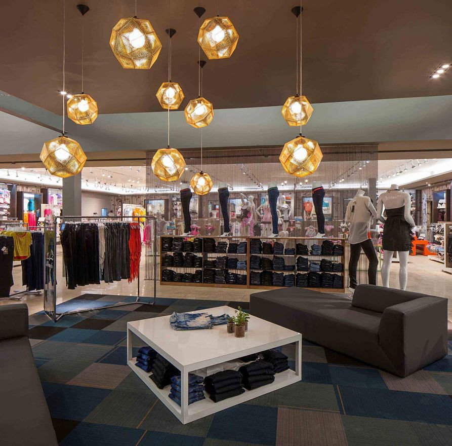
A neutral color scheme was instituted across the store, accented by unexpected pops of color. This understated palette allowed Gatsby’s vibrant new fashion lines to stand out from their surroundings: drawing customer attention to the product where it would best serve the client’s bot tom line.
With an eye to both economy and eco-consciousness, our designers opted to utilize upcycled materials whenever possible as par t of their 21st-century vision.
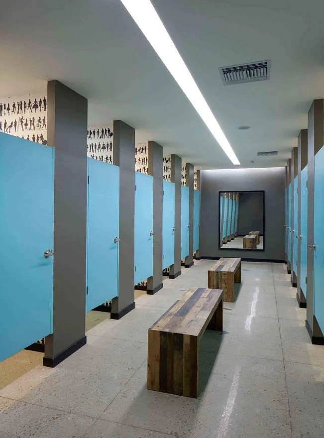
Wallpaper crafted from strips of recycled newspaper was hung. Pendant lamps, re-fashioned from the metal hoops on antique wooden barrels, dangled overhead.
Eclectic ‘statement pieces’ were positioned at strategic points around the store. Two colorful upcycled ‘T-shirt chairs’, woven entirely from fabric remnants, were placed on prominent display. Brightly-colored ottomans crafted from leftover scraps of neoprene (used to make flip-flop sandals) provided needed accents. A Frank Gehry design ‘wiggle chair’, reconfigured entirely out of recycled corrugated cardboard, tranposed this iconic, visionary symbol of upcycled design from the early 1970s to the context of a new century where environmentalism has become increasingly mainstream.
YEAR: 2011
CLIENT: Gatsby
LOCATION: Venezuela / Dominican Republic


