Mutual Services Blood Bank
When the American Red Cross shuttered its blood donation operations in Puerto Rico in 2013, there was a vacuum left open within the medical services community on the island. The Mutual Services Blood Bank entered to fill that void.
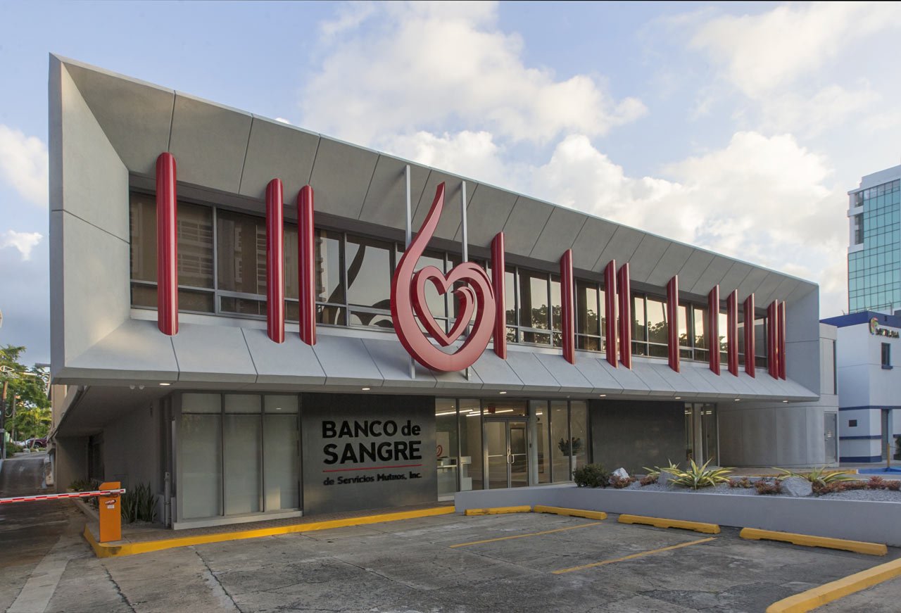
In 2014//2015, at the request of their client, Álvarez-Díaz & Villalón designed and developed a new 30,000 square-foot facility that would serve as a visual marker of the hospital’s // the corporation’s//the group’s// the founders’ long-term commitment to Puerto Rico and its people.
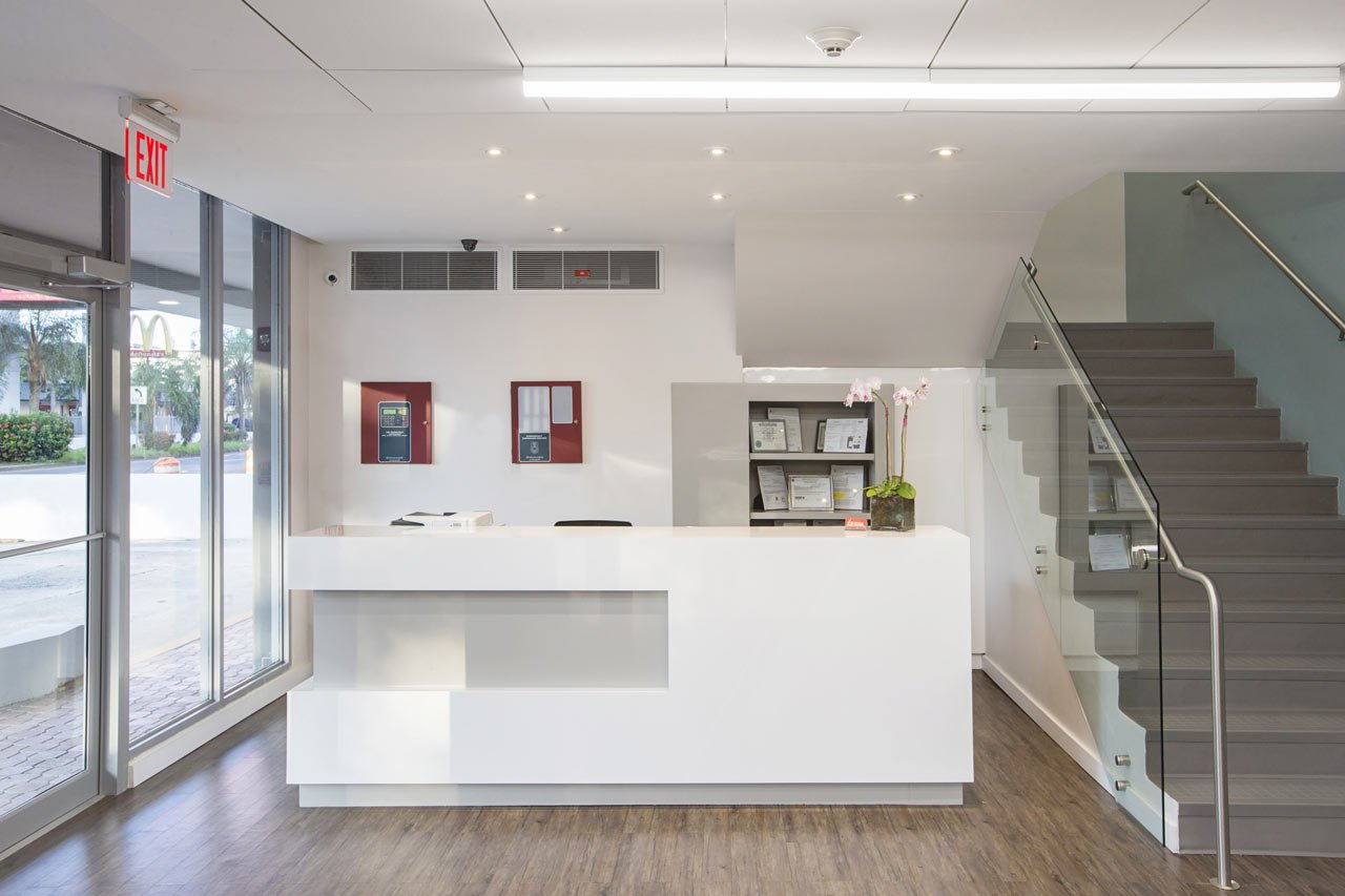
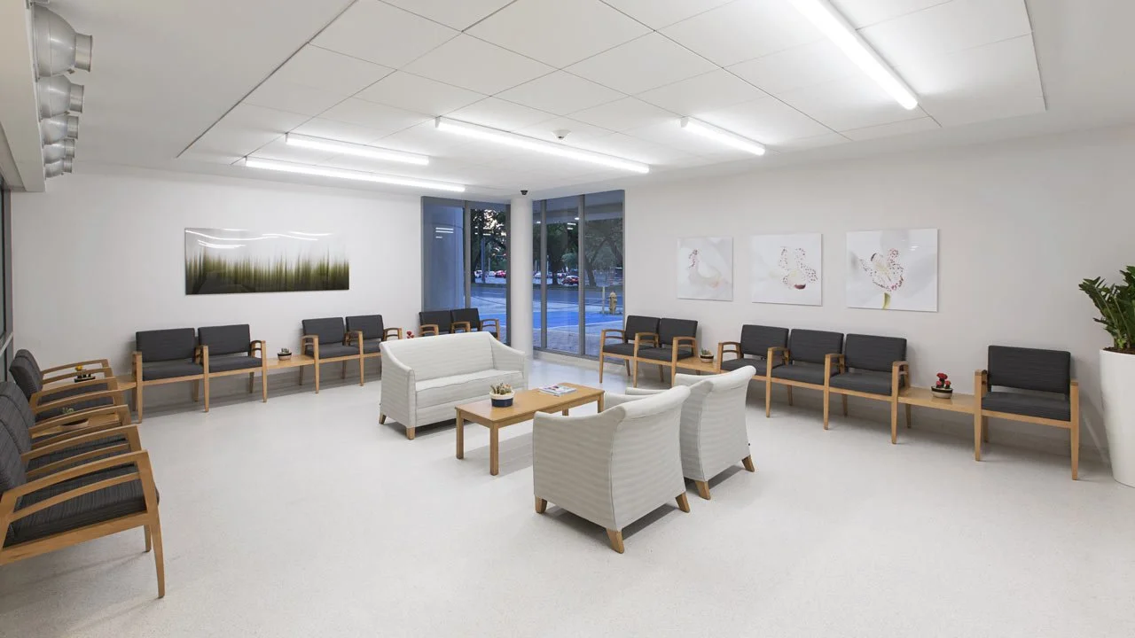
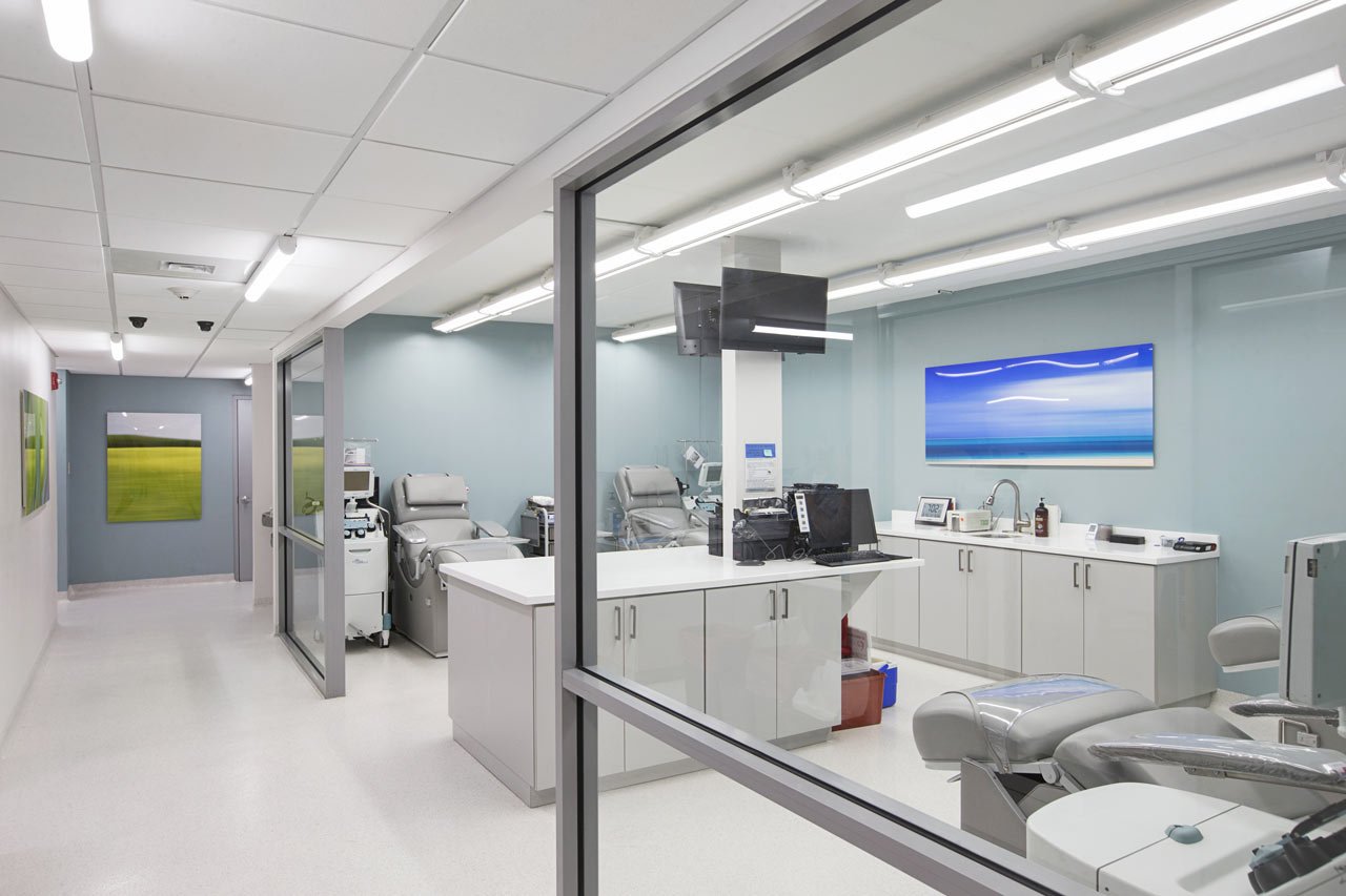
The design team at AD&V knew they wanted to create a positive space for patients and donors alike—and a brand image that was free from many of the darker, more negative connotations that had characterized such facilities in days past. Taking a cue from the hospitality industry, they recommended a look and feel that nearly resembled a spa—clean, contemporary, and uplifting—in short, the exact opposite of the typical blood bank.
At the center of the design (though slightly askew) is the iconic heart symbol. Designwise, the symbol of the heart, slightly offset to the left—was in keeping with both actual human physiology and the dynamic nature of the overall design.
Though the symbol of a heart might be considered by some to be a cliché, the design team felt, in this case, that the power of the obvious worked in their favor: helping to put the business of blood donation in a warmer, playful, and almost childlike, non-threatening context. Furthermore, beyond its literal, biological significance, the heart symbolizes love, compassion, charity, and generosity— all emotional associations that the team felt were meaningful to both the brand and the new building.
With their ‘heart on their sleeve’, the founders hope their new headquarters will send a message of gratitude to those thousands of donors who literally ‘give of themselves’ in order to save the lives of others.
YEAR: 2014
LOCATION: San Juan, Puerto Rico


